Hi, I'm

{{ floats }} {{ hfCountLabel }}

Senior Product Designer building 0→1 products since 2018

João by the water in Florianópolis {{ availDot }}Available to work
{{ t.quote }}
— {{ t.author }}

Selected work

{{ projectCount }} projects

A piece of my story

I'm a product designer with over 6 years of experience, most of it in solo or founding designer roles. So far, most of my experience has been in environments where there's still a lot to build and figure out, and I've found that I really enjoy the ownership that comes with it. Today I apply that at iGlu, a Brazilian SaaS startup building a mobile POS app that connects physical retail with e-commerce to create real omnichannel experiences.

I grew up in a very humble family: my parents sold fruit at a street market, and I worked alongside my father from a young age. Getting a scholarship to attend one of São Paulo's most respected private schools was the turning point of my life, one that opened doors I otherwise would never have access to.

I was so aware of that, and so grateful for it, that I decided to give back: while still in high school, I started DSJ, a social project helping low-income students access better educational opportunities. It ended up growing into something bigger than I ever expected, and in 2015 we were invited to present the project at the Civic BRICS Forum in Russia. A few years later, in 2018, driven by that same spirit, I co-founded Hike Academy, a coding school teaching web development to low-income teenagers and connecting them with job opportunities.

Those experiences, especially Hike Academy, taught me a lot about entrepreneurship, and gave me a broader understanding in business beyond design. Over the years, I've repeatedly found myself involved in marketing, product, coding, and other work well outside the design seat.

I've always loved drawing and technology, which is probably why product design feels like such a natural fit. Before this path, I studied architecture, which taught me more about product design than either of us could imagine (something I'd like to write about properly one day).

Based in São Paulo, but open — and actively looking — for opportunities across borders, whether that means working remotely with teams outside Brazil or relocating for the right opportunity. My biggest driving motivation, beyond the craft itself, is building a better life for my family.

Okay, pop quiz time! 🥳
If you made this far, this is going to be a lot easier:

Two truths and a lie Two truths and a lie Which of these statements you think is a lie? 🤔 {{ ttBannerEmoji }} {{ ttBannerText }} {{ o.statement }} {{ o.tagLabel }} {{ o.explain }}

Work experience

6+ years designing · 3x first designer · 2 YC-backed startups · 3 products/design systems from scratch · 1x co-founder
{{ item.date }}
{{ item.role }}
{{ item.logoEl }} {{ item.companyMain }} · {{ item.loc }}
{{ item.loc }}

{{ item.summary }} {{ item.sublabel }}

Honor/Awards

{{ item.date }}
{{ item.role }}
{{ item.logoEl }} {{ item.companyMain }} · {{ item.loc }}
{{ item.loc }}

{{ item.summary }} {{ item.sublabel }}

On repeat

I love music, so I'm always exploring different genres from Brazil and all around the world.
These are the songs that are in my recent rotation.

{{ r.title }}

{{ r.artist }}

{{ r.statusText }}

Psst, the passcode’s on the tag

{{ lkProjectName }} is passcode protected. Your job form didn’t have a field for passwords, so I hung it on the tag. Click it to peek.

This one’s locked

{{ lkProjectName }} is under NDA and needs a passcode.

No passcode? Ask me for it

{{ lkHint }}

iGlu · Endless Aisle

Feature designed for iGlu's POS app that lets sales associates sell products beyond their store's inventory, increasing monthly revenue per brand by 17%

iGlu Retail POS Mobile (Android) Discovery → End-to-end design June 2025
Overview

iGlu is a Brazilian startup that develops a mobile POS app for physical stores. "Endless Aisle" is a feature that lets sales associates sell products that are out of stock in their store but available in the ecommerce inventory. With that, we turned out-of-stock situations into sales, generating +17% in monthly revenue per brand.

My role

Discovery; End-to-end design

Team

Me PM Dev

Launch

June 2025

R$ 40 million Total revenue generated for all brands
+17% Monthly revenue uplift per brand
>332k Endless Aisle orders

Context

A customer walks into the store, finds the jacket she wants, asks for a size M. The associate checks the back: none left. The brand has plenty of them: in the ecommerce warehouse, in the other store two neighbourhoods away... but the POS in the associate's hand can only sell what's on the shelf behind them. So the customer leaves, and a potential sale walks out with them.

Some stores had built their own workaround: a QR code printed at the counter linking to the brand's website. Good idea, but it didn't really work in practice: the moment the customer walked out, nobody could guarantee the purchase would happen, and the associate would lose the commission either way. That's the gap we decided to tackle. 

iGlu is a Brazilian retail-tech startup: we make a mobile POS (Point of Sale) app for physical stores, sitting on top of an integration layer that connects physical stores, e-commerce platforms and ERPs (payments, customers, promotions, items, inventory, invoices and a myriad of other things).

The company's first bet was to be that connectivity layer: the thing that makes everything talk to everything. It was a good idea, but we hit a wall: for a good chunk of our leads, "we integrate really well" wasn't reason enough to replace the systems they already had in store. Julia (my PM at the time) and I concluded that solving the connectivity pain wasn't enough to win this market. We had to prove iGlu's ROI.

So, before designing anything, we went to talk to the stores.

Research process

1. PMF interviews in stores

We ran a round of Product-Market Fit interviews with four retail brands: two already using iGlu (Zerezes, Amaro) and two that were leads (Reserva, Oficina). In total, we spoke with 4 store managers and around 10 sales associates. We visited brands from different segments (apparel, luxury, eyewear) so we wouldn't mistake one category's headache for the whole market's.

We also deliberately kept the questions wide open. One of them was simply "What are your biggest pains?". The idea was to let priorities come from the interviewees, so that whatever we built would aim at a problem they had already verbalized, not one we had imagined.

2. The insight

We heard all sorts of pains, from checkout lines to card readers that took forever. But the one that caught our attention the most was this one:

"We lose several sales a week because of out-of-stock items"
— Cícero, store manager @ Zerezes (Pinheiros store)

Cícero didn't have an exact number, but "several sales" was already enough to catch our attention. Zerezes has a relatively high average ticket, so even half a dozen lost sales a week would already be a lot of money walking out the door. Which meant that if we managed to recover even a slice of it, our ROI would take off.

And, luckily for us, something related to this problem came up spontaneously with three of the four managers: they wanted to sell products sitting in other inventories. At that point it became obvious there was a great opportunity here.

3. Can it be done?

Before falling in love with the idea (it was already too late, to be honest), we brought in one of our engineers, Salva, to understand whether an "Endless Aisle" feature was actually feasible to build. He raised a few technical constraints (more on them in the pitch below), but nothing that killed the idea. We got the green light.

Looking back, it's hard to think of a better nickname for the person who kept this feature from dying in a feasibility doc ("Salva" literally means "saves" in Portuguese).

4. Writing the pitch

A pitch is an artifact from Shape Up, the product development process iGlu uses. It's basically a document where we synthesize the research into Problem, Appetite, Solution, Rabbit holes and No-gos. The full version of the Endless Aisle pitch is in the document below, but I'll summarize what we set out to build.

📄 [Pitch] Endless Aisle · Selling items from ecommerce

The plan was to add two new fulfillment types alongside the existing take it now: home delivery and in-store pickup, so that the sales associate could start selling items the store didn't physically have in stock.

We also decided to support mixed carts, allowing take-it-now, delivery, and pickup items to be purchased together in a single order with a single payment. The idea was to minimize friction for both sales associates and customers, who probably wouldn't appreciate having to split the same purchase into multiple transactions. It was a classic UX challenge: turning a complex problem into a simple, seamless experience.

Beyond this core scope, we also decided the feature would:

  • Show whether the item was available or not for pickup or delivery (a binary "available or not"; not an inventory count, due to technical complexity)
  • By default, search for nearby stores using the geolocation of the store where the customer is being served, with the customer's postal code as an alternative
  • In the customer registration, make important fields required (like e-mail or mobile number so the user can be notified about the delivery), and add new ones (like delivery address)

We also made a list of what would be out of scope. Most of it came from a principle we committed to right at the start: design for the lowest common denominator between Shopify and VTEX (which, at the time, were the main e-commerce platforms we integrated with).

Exact inventory counts, carrier selection and estimated delivery or pickup dates were things we couldn't guarantee would behave the same in each brand's backend. And a POS that behaves differently depending on the store's platform is a problem that would cost us dearly down the road. So availability would stay binary, the cheapest carrier would be selected automatically, and estimated delivery dates were left for a later version.

Other pains stayed out too. Ageu, manager at Oficina, when asked what his biggest pains were, answered us very sincerely: "We don't have enough fitting rooms here. Can you help me with that?". Out of appetite, Ageu! But noted ✍🏼

Design process

Step #1 — Establishing design goals

After writing the pitch, I stablished these 3 design goals for that experience:

1

Make the experience as smooth as the existing "take now"

Sales associates usually operate in fast-paced environments. The new feature had to be as simple as the standard flow of selling an in-store item, not a complex second app bolted onto the first.


2

Don't overshadow the main flow

The vast majority of sales would still be the regular "take it now" kind, and associates were already incredibly familiar with that flow. So Endless Aisle needed to be discovered when needed, without overshadowing the default path. The idea was for it to be visible enough to be found, but discreet enough to be ignored when needed.


3

Support a mixed cart

A single transaction had to hold items from both the physical store's inventory and the e-commerce inventory. Non-negotiable for the associate and the customer (as mentioned above, neither was keen on wasting time going through the payment process more than once).

Step #2 — Drawing low-fidelity sketches

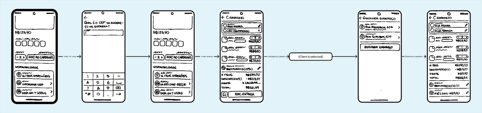
I started with low-fidelity sketches using fat marker and paper (yes, I'm that old-fashioned type 😔). The goal here was to solve the core experience: adding the new fulfillment types, deciding where availability would show up, and figuring out how to solve the mixed-cart challenge.

My biggest concern was balancing the existing "take it now" flow with the two new types. As mentioned in the design principles, I wanted to give them enough presence to be found when needed without letting them obstruct the flow that would still account for most sales.

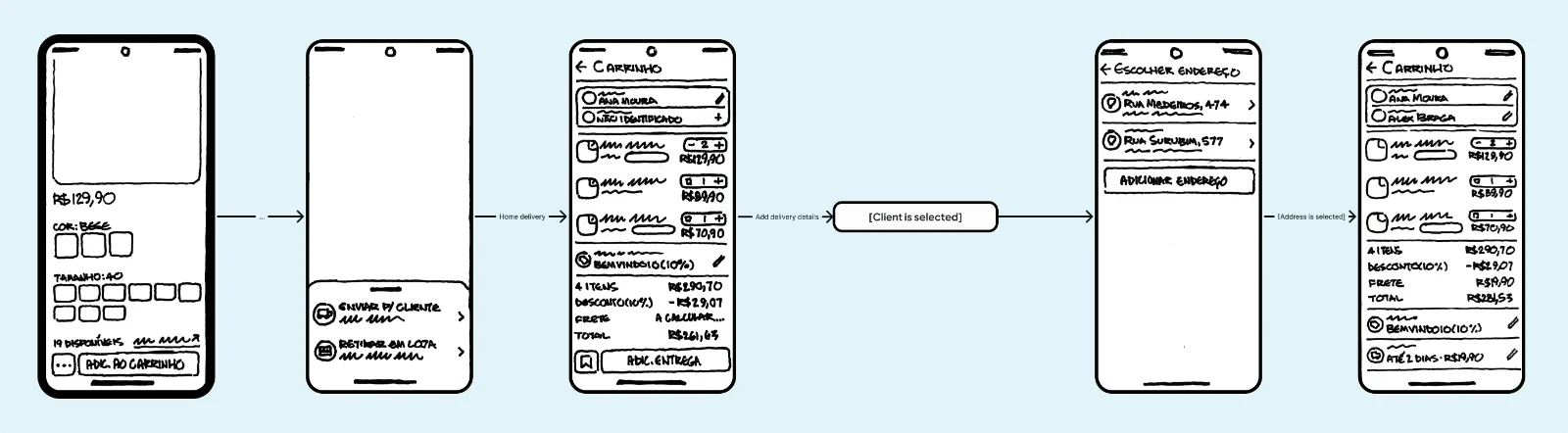
I explored two approaches for this. In the first, a "…" button would sit next to the existing "Add item to cart", opening a bottom sheet with the two new options:

Low-fidelity sketches of the first approach
Approach 1 · "…" button next to the default "Add to cart" CTA (highlighted)

In the second approach, the two new options would sit below "Add to cart"; they would appear when scrolling the item page.

Low-fidelity sketches of the second approach
Approach 2 · Both fulfillment options below the "Add to cart" CTA (highlighted)

Step #3 — Asking for feedback

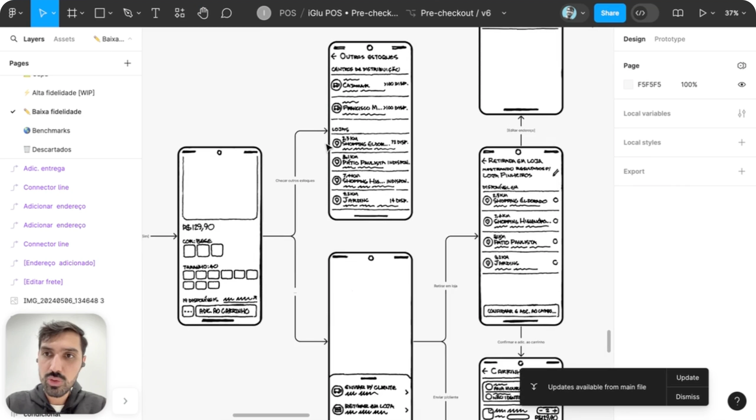
After counting on my humble fat marker to solve the core points of the flow, I scanned the sketches, organized everything in Figma and recorded a Vimeo video walking through not just the screens, but the reasoning behind each decision. Then I asked the team for feedback.

Cleaned-up sketches in Figma, with connected flows
The sketches, scanned and organized as flows in Figma

Step #4 — Designing high-fidelity screens

At this stage, besides visually refining the flow and working on another dozen details, I also ended up exploring a change. I wasn't satisfied with either of the first two ideas, so I explored a third approach: a bottom sheet that would initially show only the "take it now" option, but reveal the other two when dragged.

I explored this one because, in my perception, the other two failed in opposite directions:
  • The "…" button didn't have enough affordance
  • The option below the main CTA left the feature too hidden

The tray struck me as a great balance between the two: discreet enough not to get in the way of the main experience, but with enough affordance to invite the user to pull it and find the two new options.

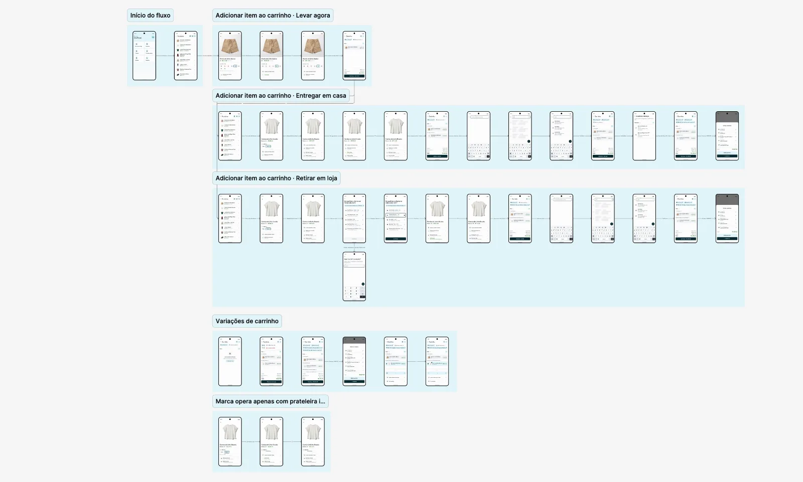
High-fidelity screen map with the take-it-now, home delivery and in-store pickup flows
The complete flow, with the draggable tray, mixed cart and every other detail solved

Step #5 — Asking for feedback, round 2

Once again I recorded a video explaining the design decisions and the reasoning behind them, but this time presenting the flow in high fidelity. The developers pushed back that the draggable tray would be hard to build, and suggested we fall back to one of the first two approaches.

Long story short: I proposed a usability test but it wasn't accepted, so I tried to better explain why I strongly believed neither of the two would work well. They were understanding, and in the end they found a library that made the implementation easier.

Interactive prototype

Tap around to explore the final Endless Aisle flow

Impact

These are the results over the first year of implementation (from July 2025 to June 2026)

+17% Monthly revenue uplift per brand
+R$ 137k Added revenue per brand, per month
R$ 40 million Total revenue generated for all brands
43 Unique brands using Endless Aisle
>332k Endless Aisle orders

Endless Aisle quickly became a meaningful revenue driver for the brands using it. In the second half of 2025, it generated more than R$17 million in additional revenue, averaging R$81k per brand per month across 35 brands.

The feature continued to gain traction in the first half of 2026, generating more than R$24 million in additional revenue. Average monthly revenue per brand grew to R$137k, a 68% increase compared with the previous semester.

Altogether, Endless Aisle has generated more than R$40 million in additional revenue across the two periods.

What I'd do differently

You may have wondered why we didn't run usability tests between the low- and high-fidelity designs, especially since both developers and I had concerns. In fact, I suggested testing whether the bottom-sheet approach was worth building, but given the feature's potential to drive sales, the CEO preferred to launch as soon as possible and gather feedback afterward. That approach made sense for me at the time, so I agreed. After launch, I visited stores to observe usage and collect feedback, and sellers praised both the feature and its UX, saying Endless Aisle sales were very simple to make. The bet paid off, but it could have gone differently.

A lightweight usability test — one prototype, five sales associates, one afternoon — would have turned my argument into evidence and made the conversation shorter and more grounded. More importantly, it would have reduced the risk of spending hours building something users might not adopt.


iGlu · POS Software Redesign

Redesign of iGlu's point-of-sale MVP to fix known UX issues, address user feedback and bring a consistent, visually appealing design.

iGlu Mobile (Android) March 2024
Grid of redesigned iGlu POS screens

Overview

iGlu is a Brazilian SaaS startup that provides a Point of Sale (POS) software. Their MVP was well received by early users, but since it was mostly designed by non-designers, it had a few UI and UX flaws. I led the redesign of the whole checkout flow: from single-task screens to a new design system.

My role

End-to-end design

Team

Me

Launch

March 2024

4 Design objectives
3 Fidelity stages, from sketch to hi-fi
1 Design system built from scratch

Context

iGlu is a Brazilian SaaS startup that provides a Point of Sale (POS) software. They entered the market with a Minimum Viable Product, which had a great acceptance from early users.

However, as the MVP was majorly designed by non-designers, it had a few UI and UX flaws. So I was brought on board to lead a redesign effort, whose goals were mainly to fix known UX issues, address user feedback, and bring a visually appealing design.

Objectives

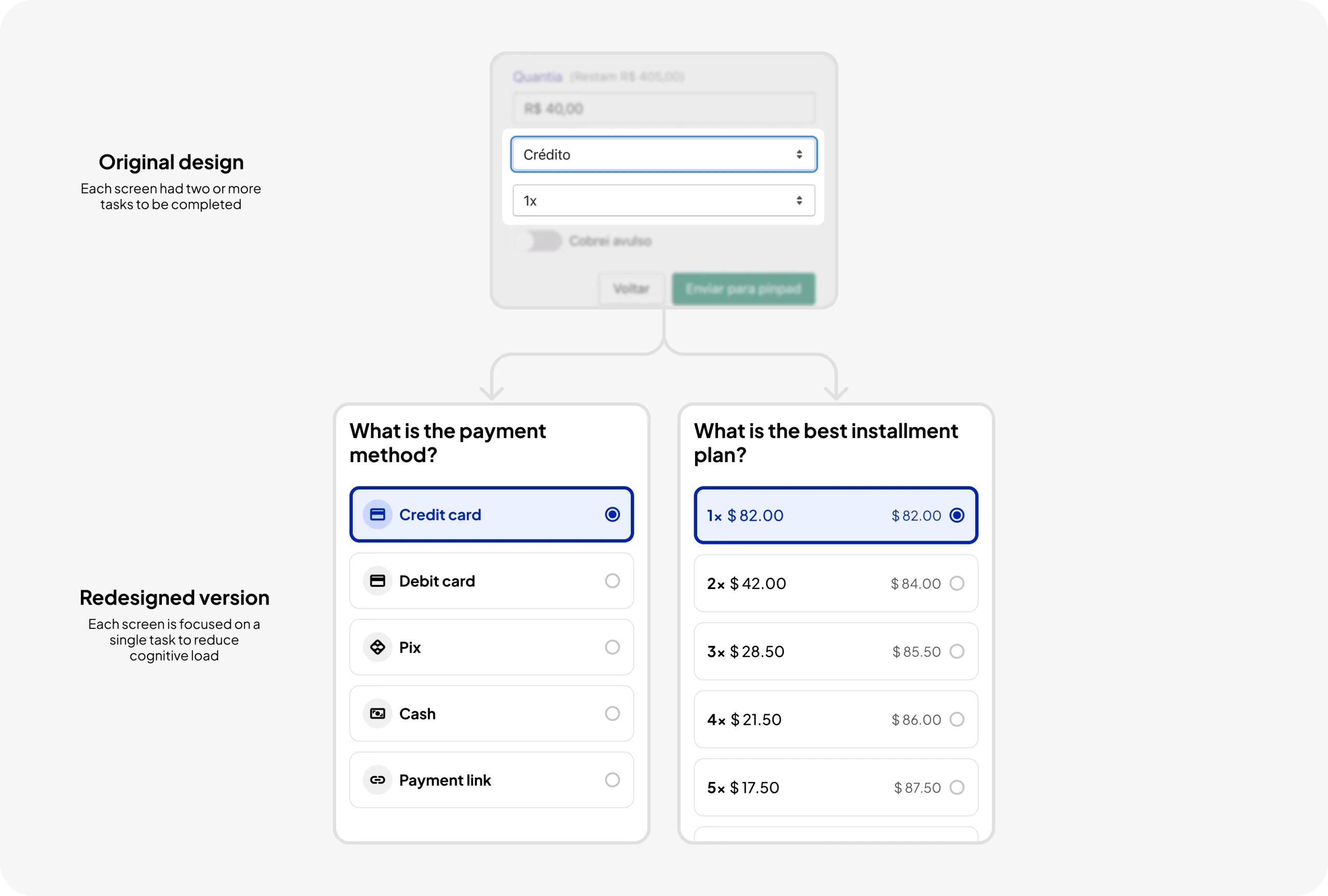
1. Reduce cognitive load

I tried to achieve this by restructuring each screen to focus on a single task, eliminating distractions and ensuring users could interact with the software one step at a time. My goal was not only to simplify the user experience but also to make overall usability easier.

Original payment screen split into two single-task screens
Before · each screen had two or more tasks  →  After · one task per screen

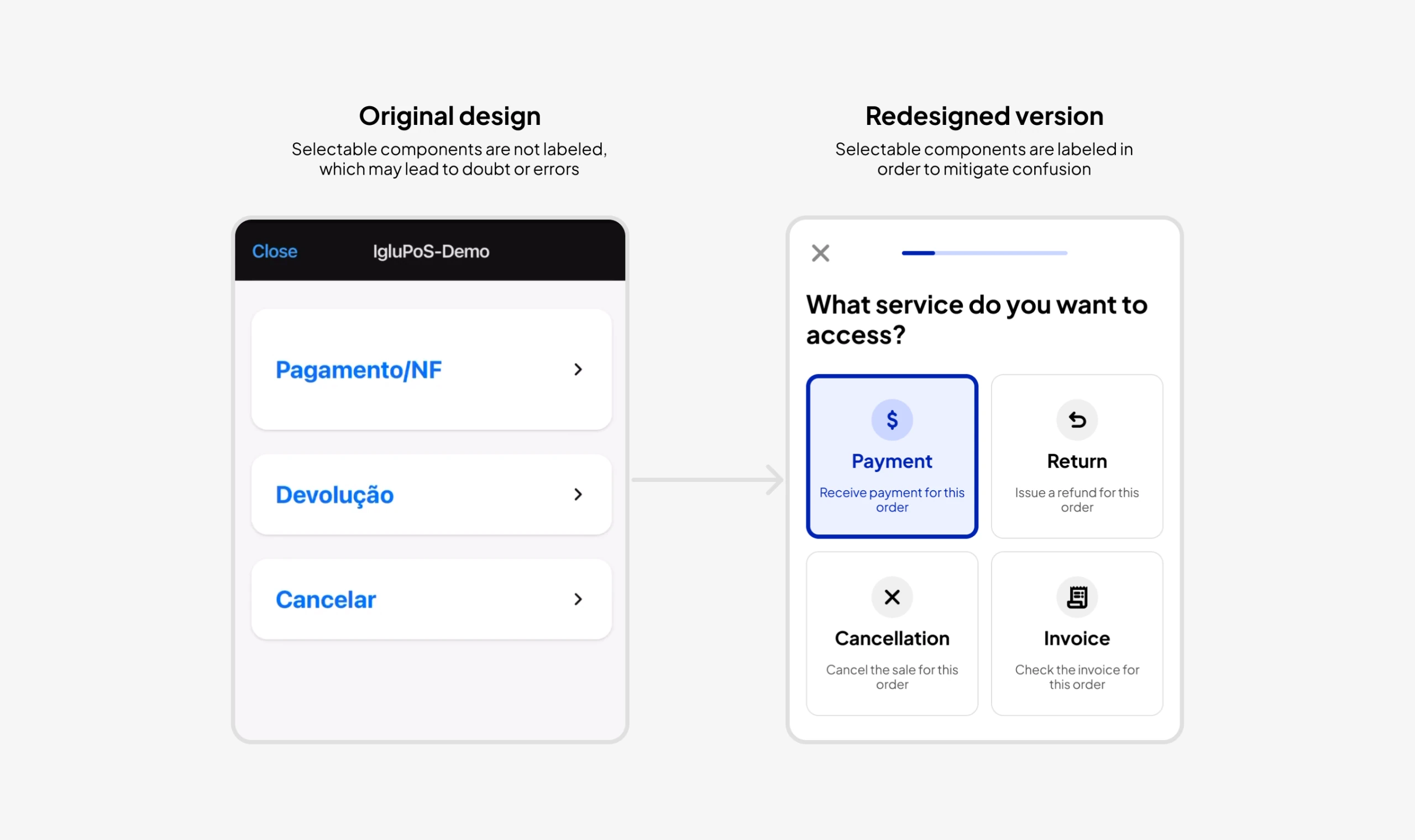
2. Enhance self-explanatory design

The software contains intricate and occasionally complex concepts. To mitigate user confusion, I incorporated small on-screen descriptions to provide instant context. This approach aimed to reduce reliance on external resources, such as help centers or documentation.

Unlabeled service list compared with labeled service cards
Before · unlabeled options  →  After · each option carries a short description

3. Create design consistency

To prevent users from getting confused and questioning why components behaved differently in various parts of the software, I maintained design patterns. Each component has a singular, predictable behavior.

4. Optimize for agility

Given the target users are vendors, often operating in fast-paced environments, I streamlined the design to cater to their efficiency needs. I created prominent, easily clickable components and made the most commonly used options pre-selected to minimize steps in the process. This design strategy aimed to enhance the agility of vendor interactions with the software.

Design process

Step #1 — Understanding the challenge

The project started by the client sharing a list of desired improvements, primarily driven by customer feedback. Users expressed concerns about small buttons and components and how this, as well as a few laggy interactions, affected the time they had to spend to go through the whole flow.

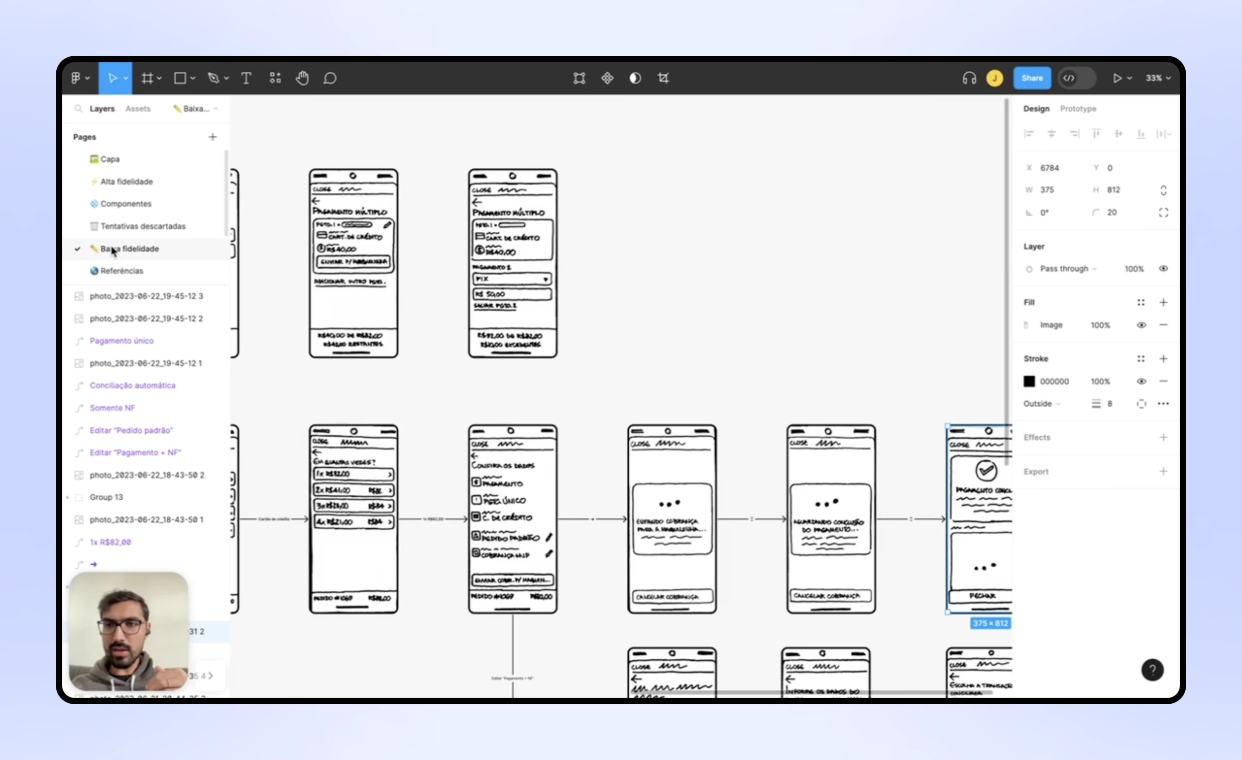
Step #2 — Drawing low-fidelity sketches

I initiated the design process with low-fidelity drawings using fat marker and paper, then scanned them and organized them in Figma. These initial concepts were shared with the client through a Vimeo recording in which I not only presented the drawings but also shared the rationale behind my design decisions, inviting feedback and suggestions.

Scanned fat-marker sketches organized as flows in Figma
The sketches, scanned and organized as flows in Figma

Step #3 — Wireframing

After two rounds of great feedback and alignment on the low-fidelity drawings, I moved on to wireframes, keeping the same feedback process to make sure client expectations and project objectives were met. This phase allowed for a more detailed exploration of the interface, including an initial design of the main components within an early design system.

Grayscale wireframes of the payment flow in Figma
Wireframes, with the first versions of the main components

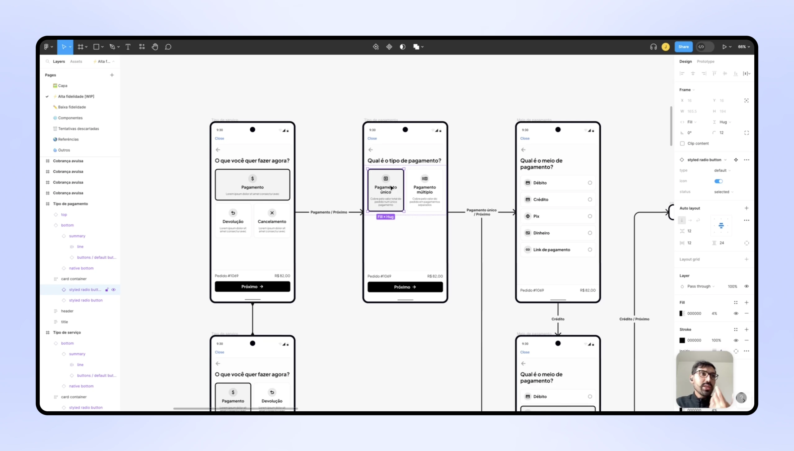
Step #4 — Designing high-fidelity screens

After a few iterations and major decisions in the previous phase, the final stage involved translating the wireframes into high-fidelity screens and creating a component library. I kept the same feedback approach from the previous stages.

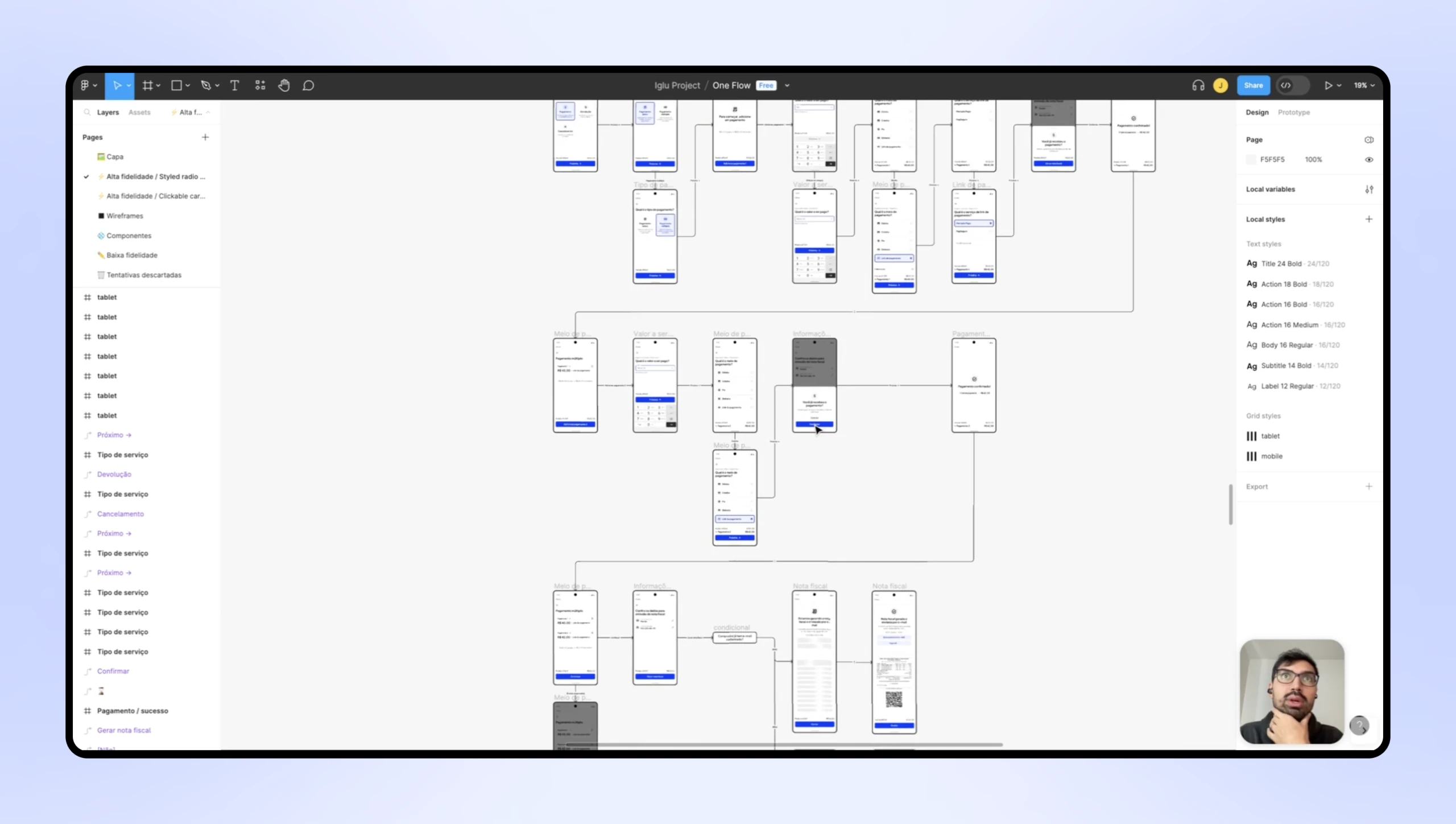
High-fidelity screen map of the whole flow in Figma
The complete high-fidelity flow in Figma

Design system

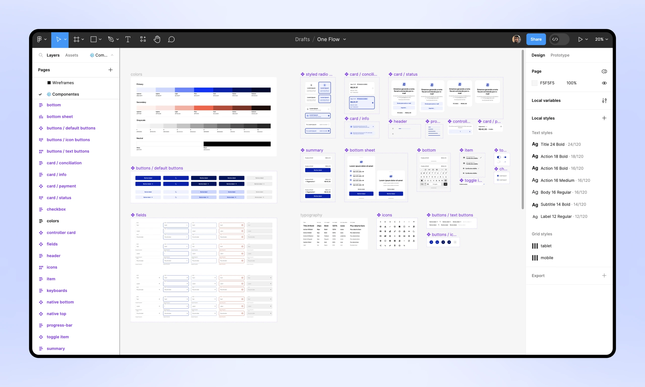
While designing the solution, I also worked on a small design system to maintain consistency and coherence, as well as to facilitate future enhancements. As the project and my alignment with the front-end team evolved, so did the design system, adapting to new insights and requirements. Once I finished the high-fidelity screens, I revisited and refined it. Here's a glance at the finished version:

Component library in Figma: colors, typography, fields, buttons and cards
Colors, typography, fields, buttons, cards and the rest of the component library

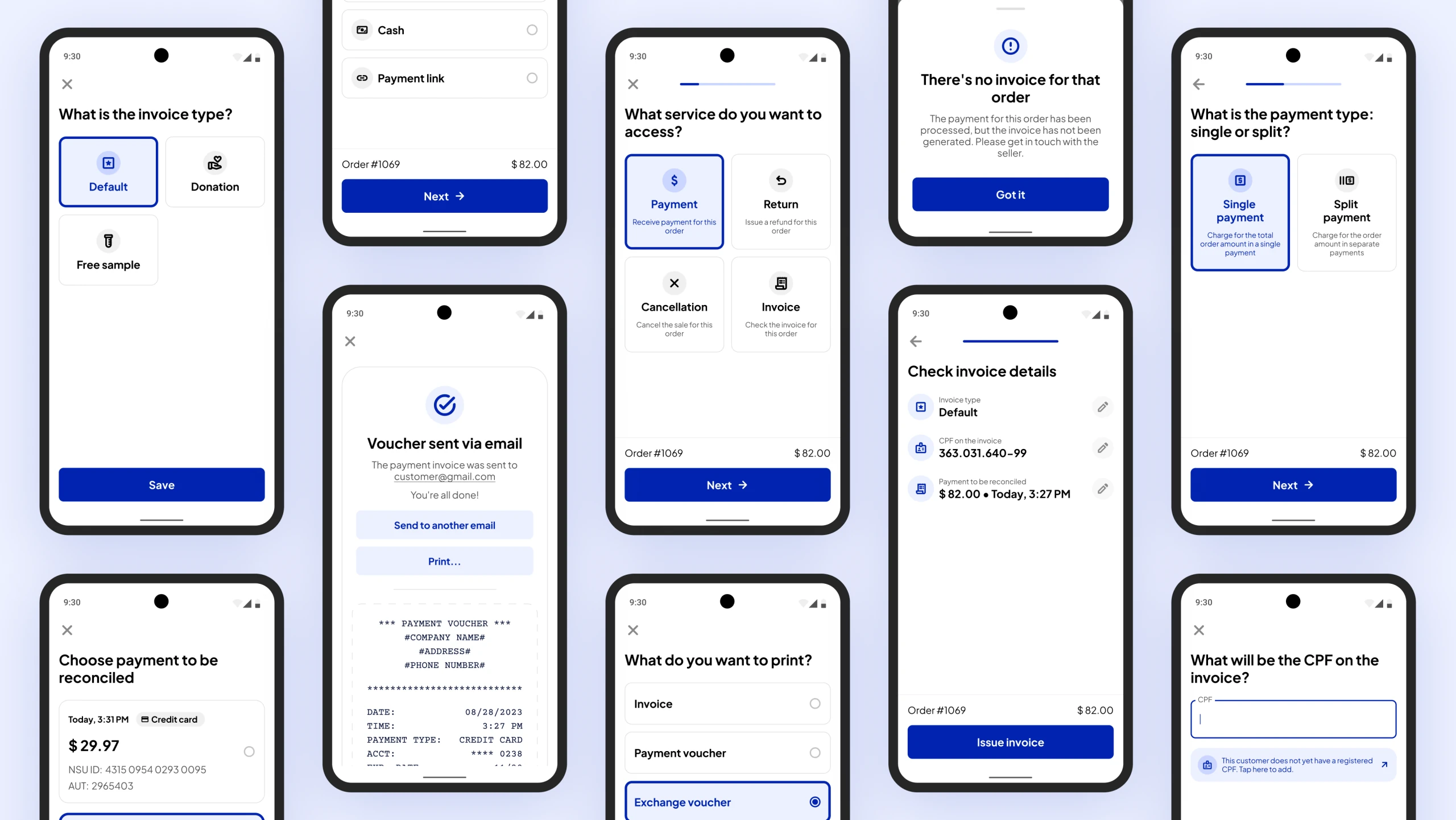
Final screens

A few highlights from the final flow

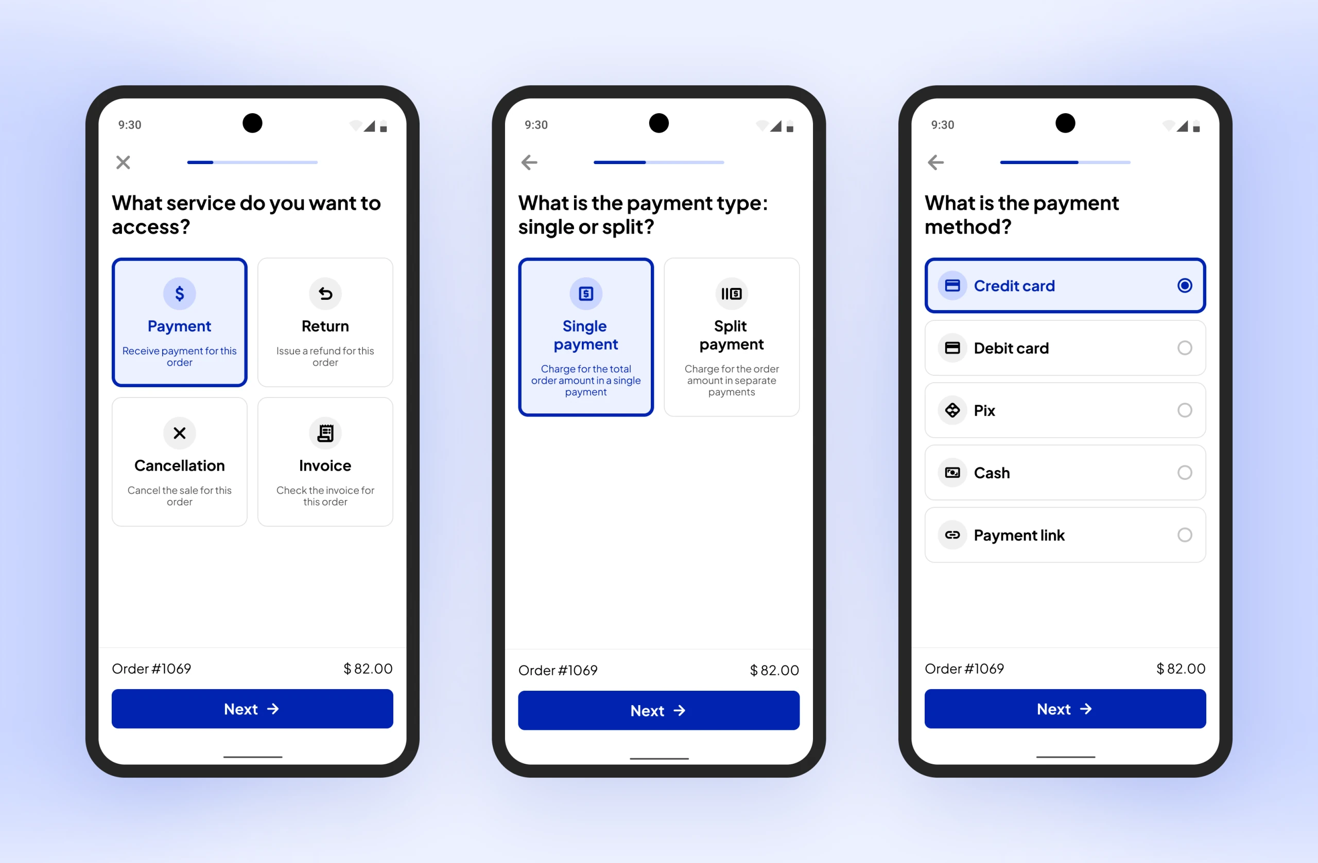
Service, payment type and payment method screens
Choosing the service, the payment type and the payment method
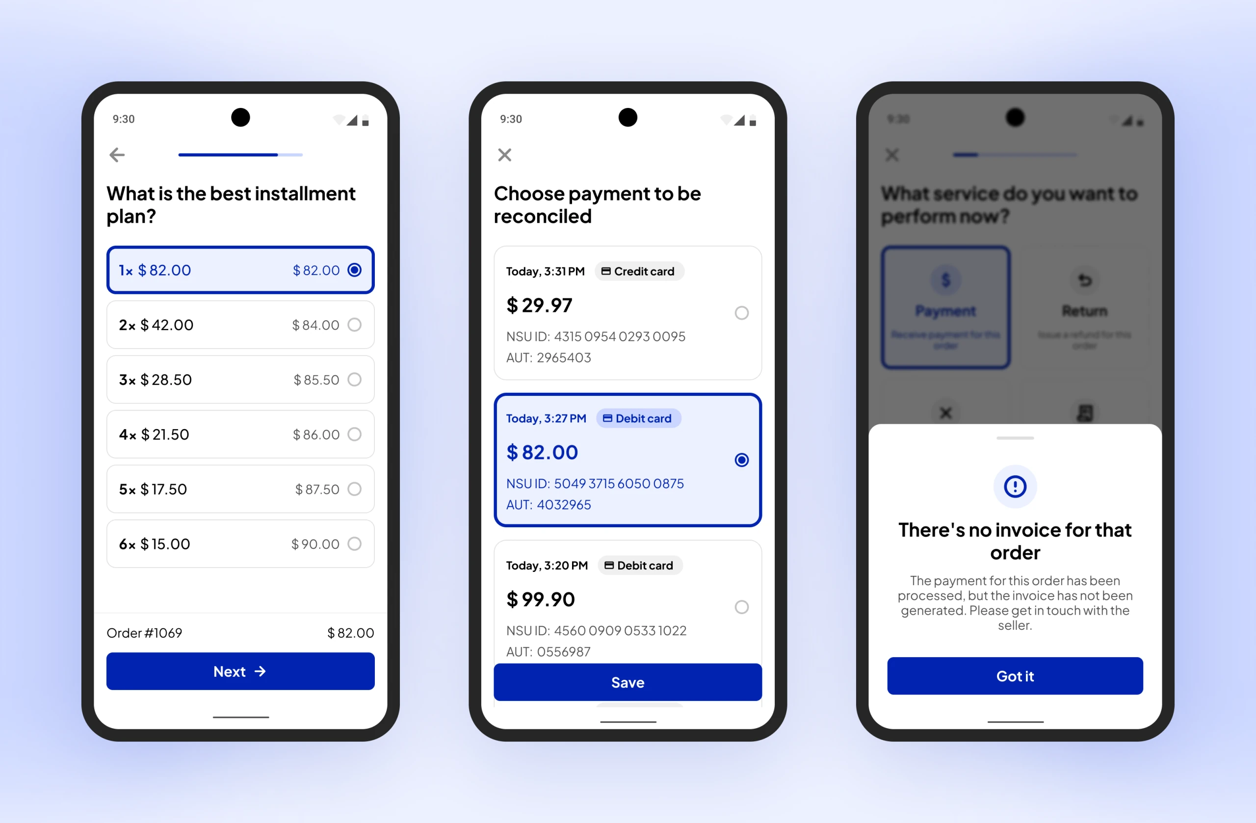
Installment plan, payment reconciliation and empty-state screens
Installment plan, payment reconciliation and a "no invoice" bottom sheet
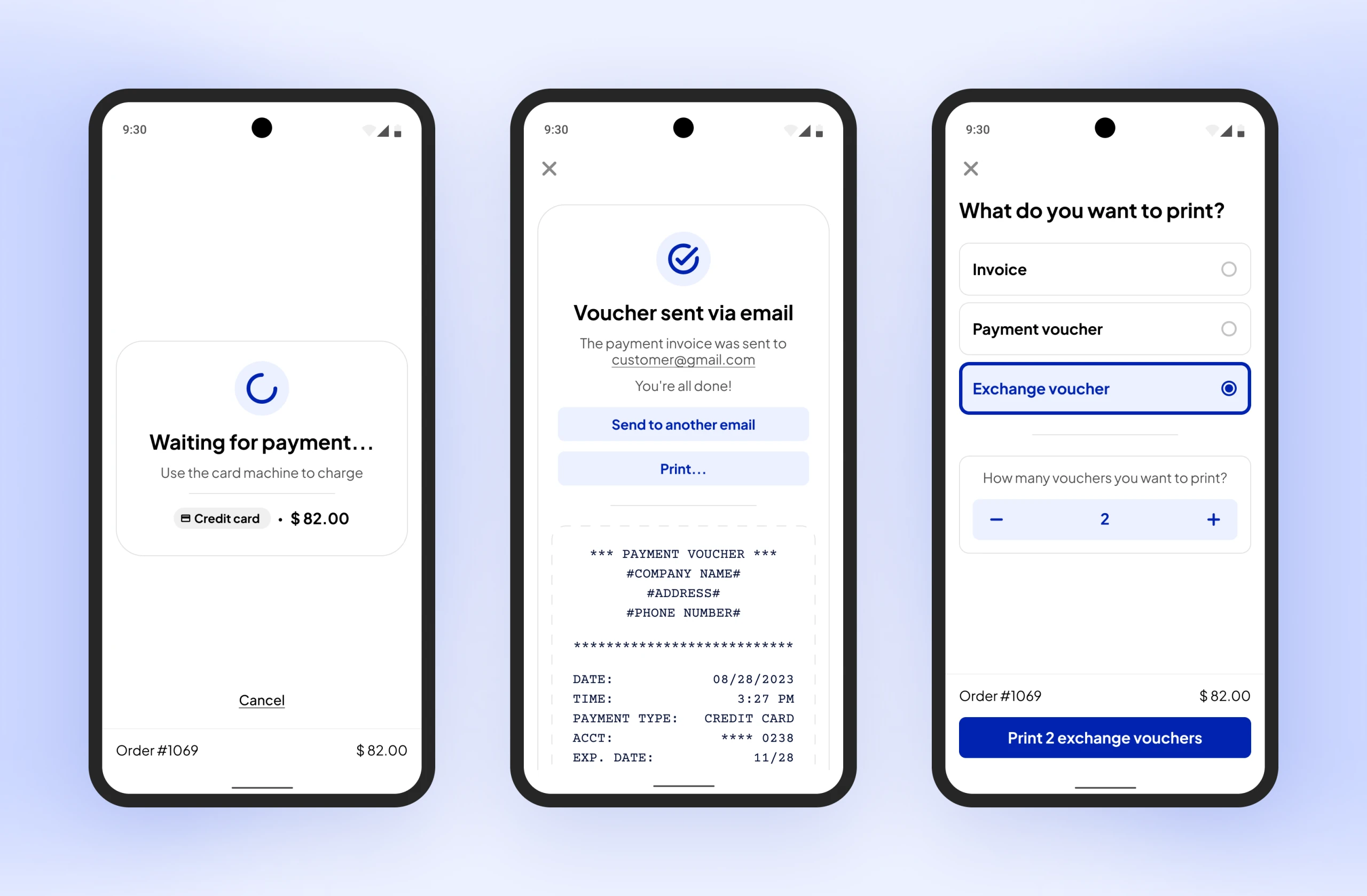
Waiting for payment, voucher sent and print options screens
Waiting for the card machine, voucher confirmation and print options
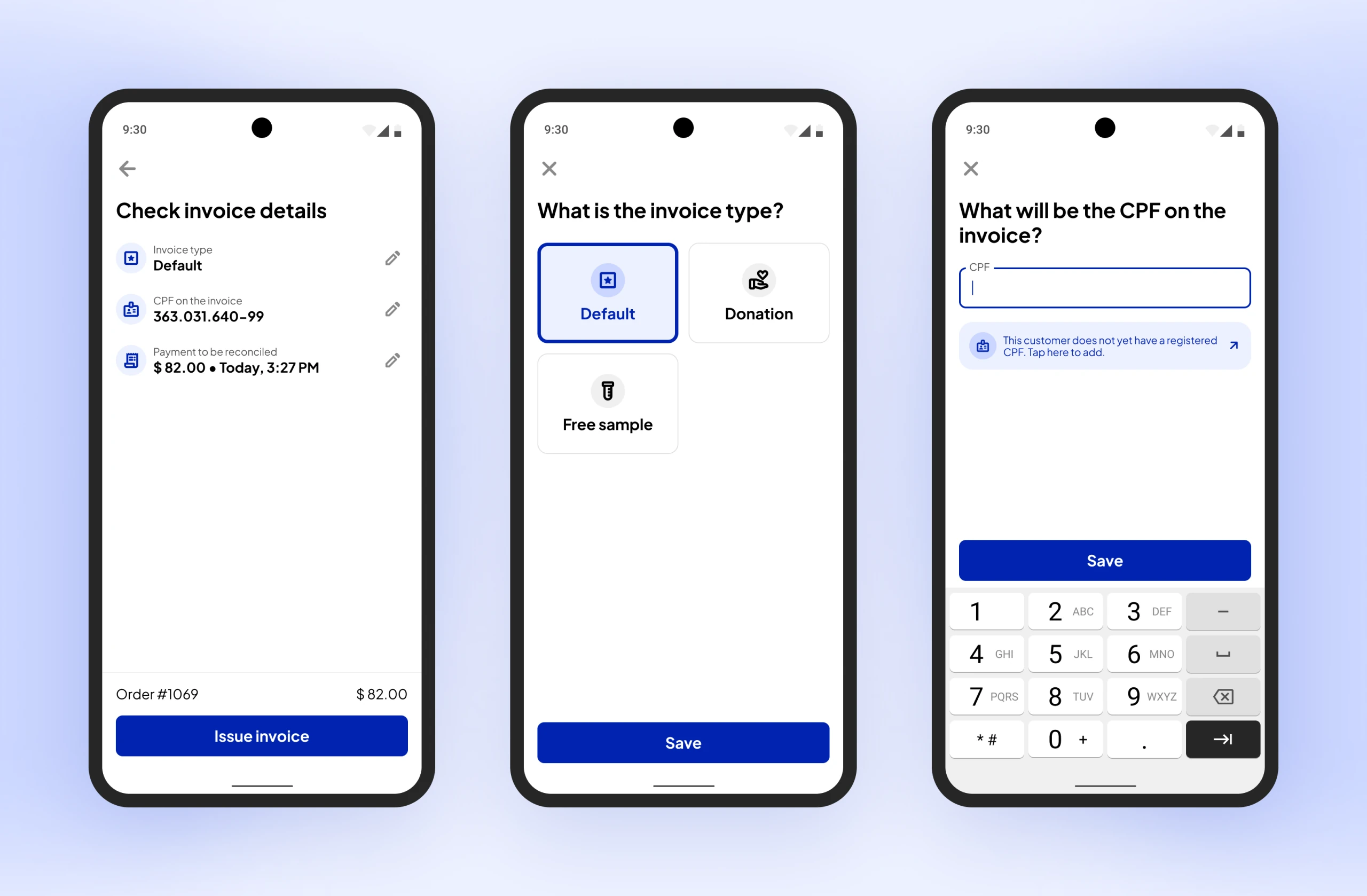
Invoice details, invoice type and CPF entry screens
Reviewing and editing the invoice details

Results

As of now, the project hasn't been rolled out to users, so I still don't have specific information about outcomes and the impact on user engagement. I hope I can share them here soon, though!


Forma · Strength-training app (built with AI)

Forma is a strength-training app built around progressive overload. I designed and built it end to end with AI.

Forma Mobile (PWA) October 2026

Overview

After trying several gym apps and never quite liking any of them, I designed and built my own. Forma is a mobile strength-training app built around progressive overload. It creates a personalized plan, suggests what to lift in every set, and makes it easy to see how you're progressing over time.

I took it from idea to a live product on my own, using Claude Design, Claude Code and a handful of other tools. That meant writing the specs, designing the UX, testing in real workouts, and shipping nearly 30 pull requests in the first few days.

Tools

Claude DesignClaude CodeChatGPTGitHubNetlifySupabase

My role

End-to-end design & development (product specs, UX design, testing, deployment)

Context

I've been strength training for a few years and have tried several workout-tracking apps. Spotr was the one I liked most, but I still felt there were important gaps.

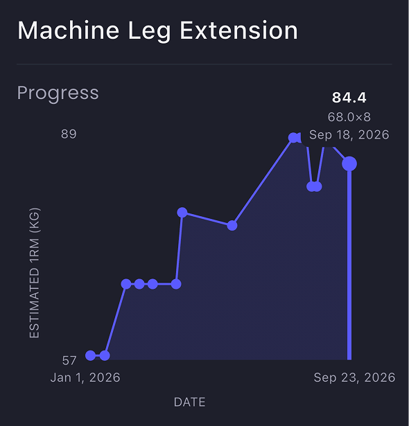
Spotr’s estimated 1RM graph for machine leg extension
The app only offers 1RM charts for exercises, which I find a little abstract
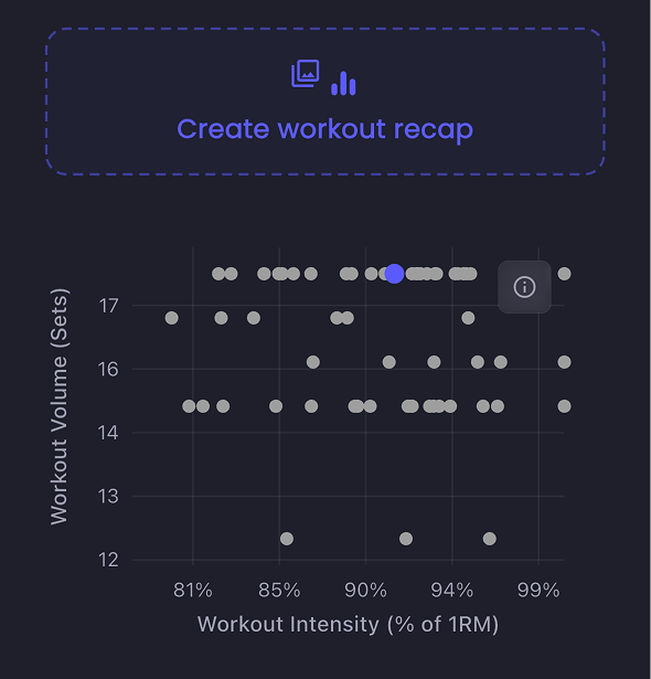
Spotr’s scatter chart of workout volume against intensity
Their post-workout chart is hard to interpret, and I missed a celebratory feel
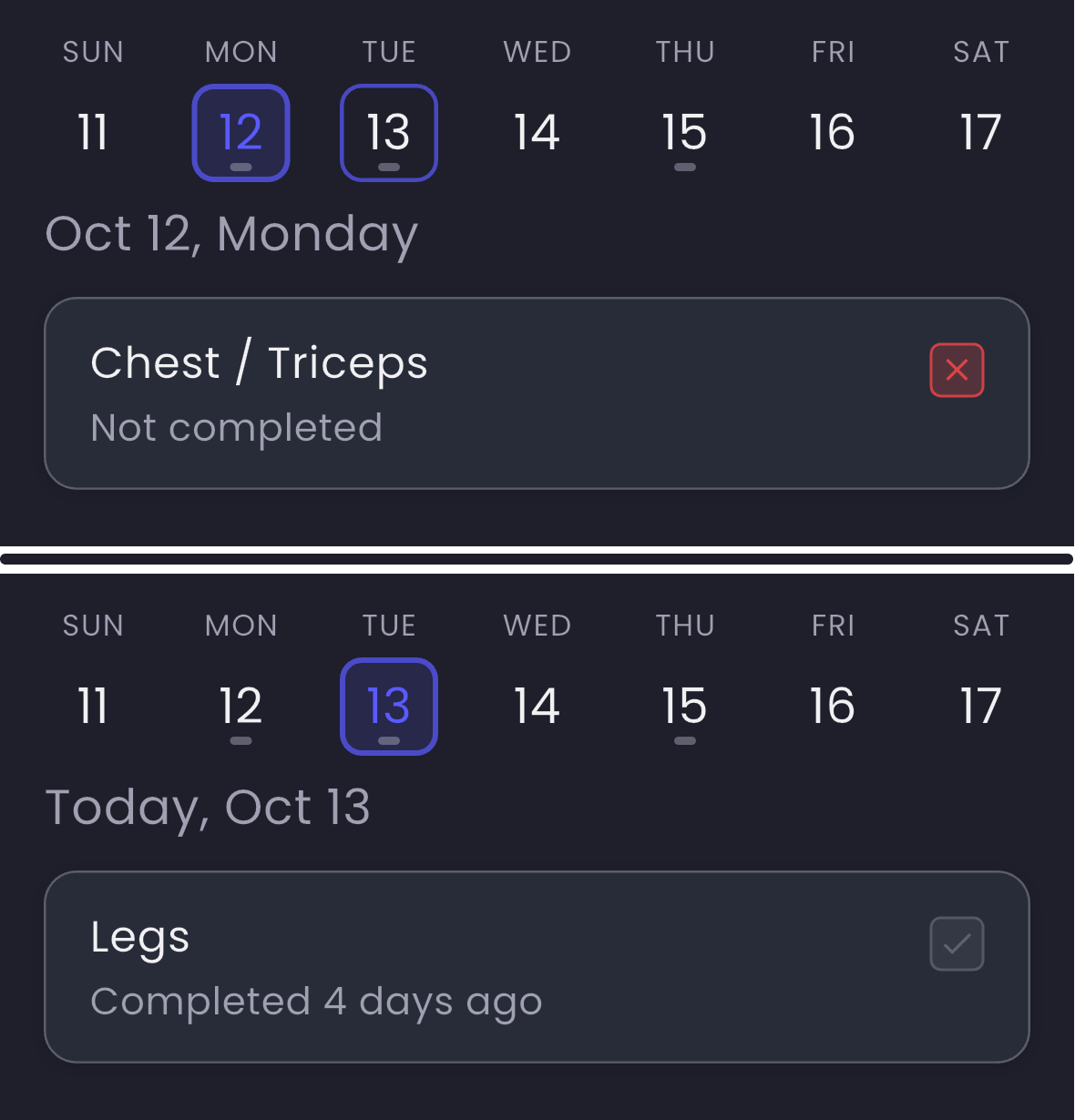
Spotr’s weekly view: Monday’s Chest / Triceps marked not completed, while Tuesday still suggests Legs
The app doesn't suggest a missed workout as the next one
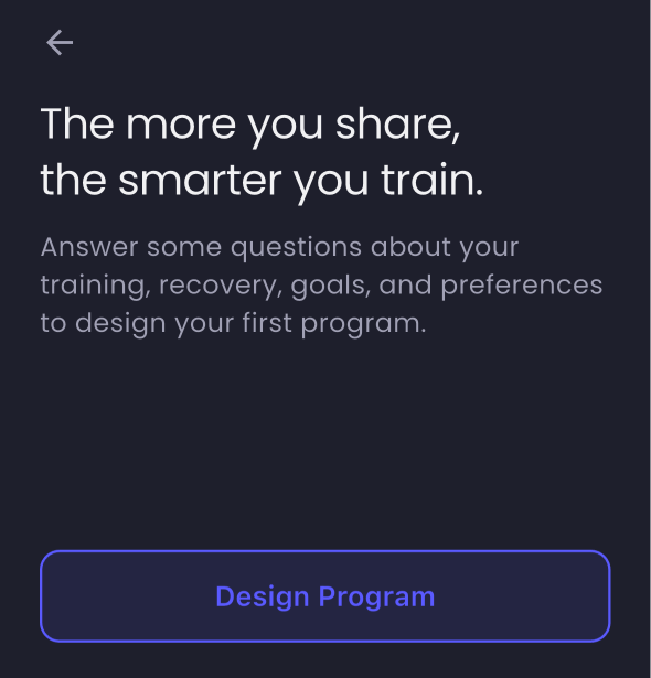
Spotr’s onboarding intro, with Design Program as the only way to start
I couldn't import my existing workout plan; I was forced to create one from scratch

A few months ago, in a casual conversation with Gustavo, a close friend of mine, I learned not only that we shared some of the same frustrations with workout apps, but that he was frustrated enough to build a prototype of his own, made with Lovable.

He invited me and a couple of friends to try it and share feedback. I used it during one of my workouts, but gave up halfway through. These are the problems I noted and sent him:

  1. “I can't add the exercises I actually do.” I expected to find this under “Edit”.
  2. “There are no exercise demos.” On day one, a beginner wouldn't necessarily know what a “barbell overhead press” is.
  3. “There's no clear reason to pick this app.” Spotr at least promised to help me keep breaking personal records.
  4. “My progress is either hidden or unreadable.” The app didn't show anything about progress. I couldn't make much sense of Spotr's charts, but at least they existed.
  5. “Why are weights only in pounds?” Gustavo lives in the US, but I was born and raised in Brazil, where we use kilograms. Since the app only offered pounds, I couldn't even log my weights properly.

Gustavo eventually dropped the project, but encouraged me to build my own. That's when I decided to build Forma, drawing on everything I'd learned so far. On top of that, each of my frustrations with Gustavo's prototype eventually became a product decision: custom exercises, a 1,325-exercise library with an animation for every exercise, progression and personal records at the core of the experience, clear progress tracking through weight, volume and 1RM, and support for both kilograms and pounds.

Design process

In short: I designed and built Forma on my own, from PRD to live app, over a few weeks of real gym use and a lot of QA. The hardest parts were the logic-heavy ones, like adaptive scheduling, which I wrote as specs before touching a screen. The riskiest feature was the one where AI had to get it right on its own: importing an existing plan from text. But it hit 99.3% field accuracy and 98.5% exercise-matching before I even designed the UX.

1. Choosing the tools

I decided to design Forma in Claude Design, choosing it over more technical tools because I wanted Forma to be strongly UX-driven, and Claude Design was a better fit for that than any other tool. It also gives me more creative freedom.

Still, I knew I'd need a tool to help me build the logic-heavy parts (for instance, how progress is calculated, or how to suggest progressive overload), and to handle the database and engineering side. For that, I chose Claude Code. Besides these two, I also used ChatGPT, GitHub, Supabase and Netlify; you can see how in “First version and setting things up”.

2. Writing the specs (PRD + Visual Direction)

I started with what I believe is one of the most important steps when building a product from scratch with AI: writing solid fundamentals. I asked ChatGPT to interview me in depth, covering every question needed to write a great Product Requirements Document. In a nutshell, the idea was to build a “smart, friendly, visual training logbook with progress at its core”. The PRD also included instructions to import ExerciseDB, a free database with ~1,300 exercises.

Then, following the same interview process with ChatGPT, I wrote a document describing the visual direction I had in mind for Forma. I wanted it to have a warm, friendly personality, so I documented I wanted a minimal, playful visual language with bold typography and expressive illustrations. Here are both documents in full:

3. First version and setting things up

With both documents ready, I asked Claude Design to build Forma's first version, attaching them as context. The result was a prototype with personalized plans, scheduling, progression rules, and a library of ~1,300 exercises already in place. The experience and interface, in contrast, were what you'd expect from a first AI-built version: pretty average. At first glance, I could already spot a dozen things that needed refining.

But before diving into individual UX issues, I wanted to turn the prototype into a real, usable product from day one: something I could install on my phone, take to the gym, and trust to save my account, workout plans, and training history.

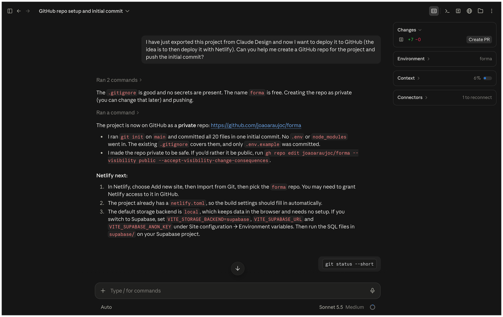
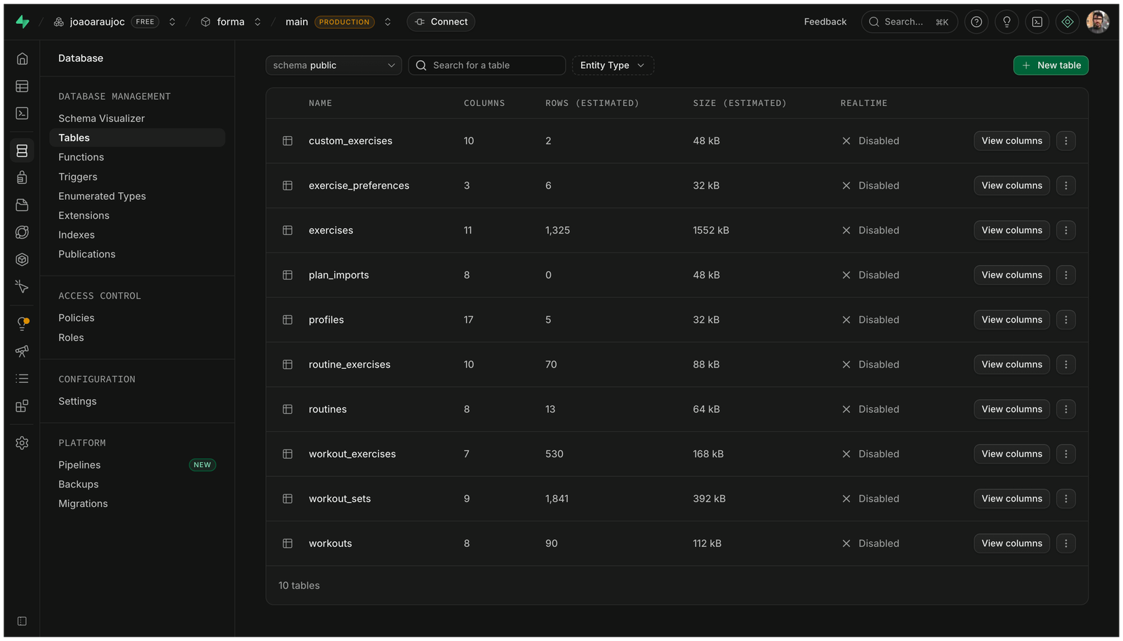
So I exported it into a GitHub repo, wired up a Supabase database for accounts and workout data, and deployed it to Netlify on its own URL — after that, every merge went live on my phone automatically.

Claude Code creating Forma's GitHub repo and pushing the initial commit
Using Claude Code to create the GitHub repo and push the first commit
Forma's Supabase database tables: exercises, routines, workouts and sets
Supabase database, storing accounts, plans, workouts and logged sets
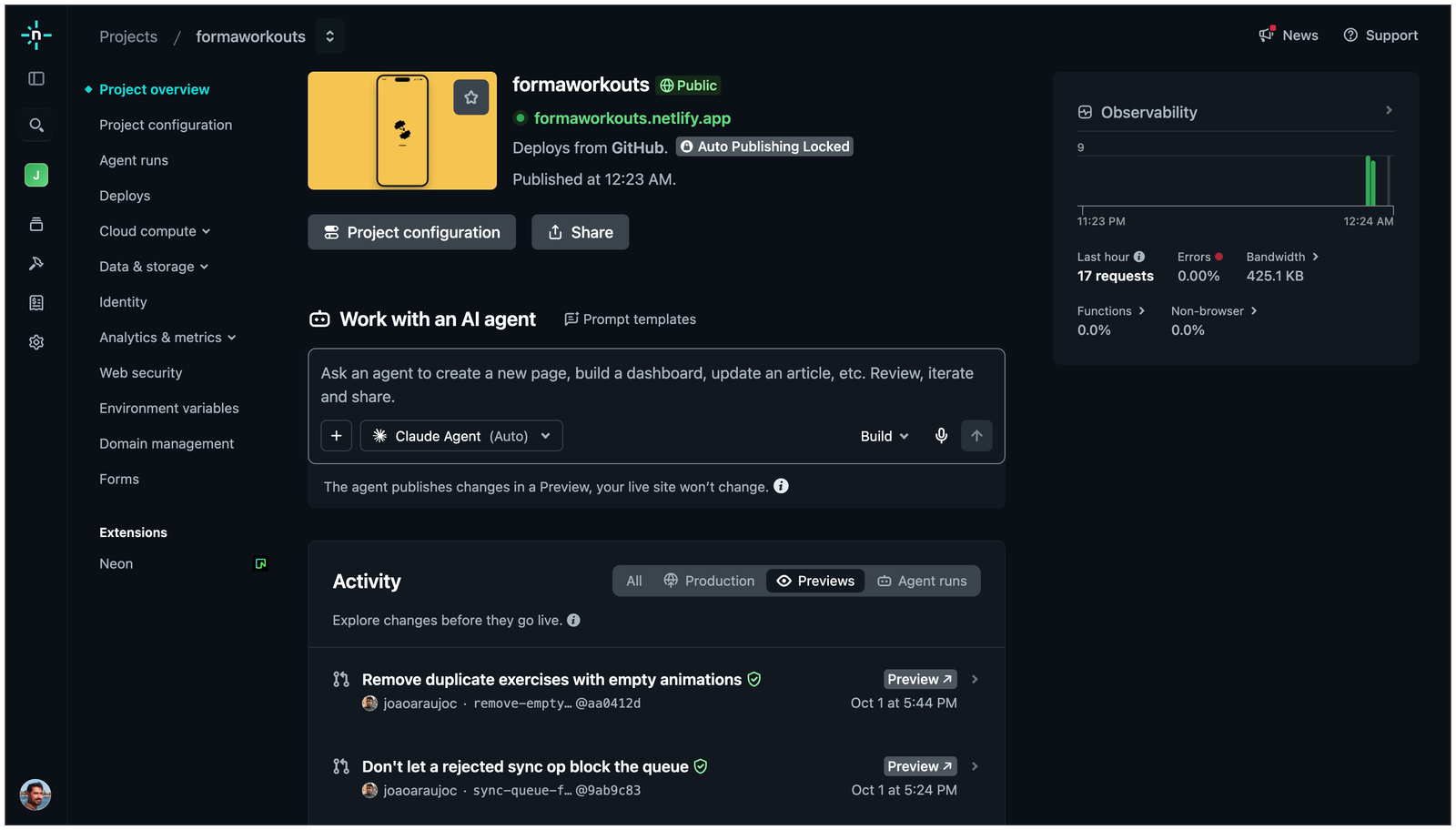
Forma's Netlify project overview, live at formaworkouts.netlify.app and deploying from GitHub
Forma, live on its own URL with the help of Netlify

4. Improving visual hierarchy

With the setup out of the way, I went back to that list of things to refine. As I mentioned, the first version was pretty average in both UI and UX. My first impression was that it was information-heavy and lacked a clear visual hierarchy, which made it hard to navigate and understand its features at a glance.

So I did a major redesign, shown below. The idea was to introduce a stronger visual hierarchy, clearer grouping, and intentional whitespace to make information easier to scan. Underneath it all, I wanted users to understand what to do next without friction.

{{ c.oldAlt }}
{{ c.newAlt }}

5. Bug hunting

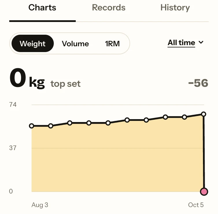
Chart headline showing the latest session as the top set
Top set ≠ last set. The app was showing odd “top sets”. I noticed it was treating the latest session as the top set instead of the actual record.
Jumpy screen. On the “Workout in progress” screen, tapping a number made the layout jump, making the rest timer move along with it.
Drag and drop. While reordering exercises, cards drifted away from my finger. I fixed it by making the card remember where you grabbed it.
The bouncing frame. On iPhone, the whole viewport scrolled instead of just the content, preventing users from actually scrolling the content.

6. Writing specs for the logic-heavy fixes

Bugs like these were quick to describe, so I could simply ask Claude Code to fix them. The logic-heavy parts, like scheduling and progress targets, were a different story: mockups weren't enough. So I wrote specs and handed them to Claude Code:

Custom workout order

Spotr ties each workout to a weekday. In my plan, for example, “legs” were on Tuesday, and “back and biceps” on Thursday. If I missed legs on Tuesday and made it to the gym on Thursday, Spotr suggested back and biceps, which I'd done four days earlier, instead of the legs I hadn't done in ten. That didn't make sense to me.

I considered ordering by how long ago you last did each workout, but that could stack two upper-body days in a row, which isn't good for recovery. So I landed on adaptive order: keep the plan in sequence, but always resume from the workout you actually missed. It's by far the best rule for me, but not everyone would want that, so it's a setting: Adaptive by default, alongside fixed-weekday (like Spotr) and catch-up modes. A few rules hold across all three: rest days never count as “missed”, a missed workout never moves automatically, and the split keeps cycling instead of resetting every Sunday. I wrote it down as a spec with concrete examples for Claude Code:

📄 forma-custom-workout-order.md

Weekly, monthly and yearly progress

The original version of Forma had a “week streak” logic. If you went to the gym at least once a week, no matter what your weekly target was, the app counted it as a successful week. I find that discouraging; I wanted progress to be measured against the plan I'd actually committed to. So I wrote a spec for it: completed workouts against a target, for this week, this month or this year.

The core rule is that the target is the number of scheduled training days in the period, counted from your signup date. The spec also covers edge cases, like that extra workouts aren't capped, and that nothing before signup counts, so a new account doesn't start the month already behind.

I wrote it like a test, using my own week as the example: an account created on Tuesday, September 15, 2026, training Monday, Tuesday, Thursday and Friday, should get a weekly target of 3 and a monthly target of 9. That precision paid off later. After implementation, I caught a bug that inflated the targets: the number on screen didn't match my own week, and the spec said exactly what it should have been.

📄 forma-adaptive-workout-streak.md

7. Adding new features

Once the foundations felt solid, I went back to the list of frustrations that started Forma. Two of them still had no answer in the product: “There's no clear reason to pick this app” and “I couldn't add the exercises I actually do”. I also wanted Forma to work for people who already train, not just beginners.

An intro that sells the value

The first thing new users saw was a generic app description — no reason to create an account, the same gap I'd flagged in Gustavo's prototype. So I replaced it with a six-slide, swipeable intro, each slide covering one promise with real mockup UI.

Custom exercises

Even with 1,325 exercises, someone's gym-specific variation might still be missing (as happened to me when I tried to add my beloved “Machine rear delt fly”). So I put it where you'd look: search the library, and if there's no match, the first result is “Create ‘your search’”. Custom exercises support five types (weighted, bodyweight reps, assisted, timed, weighted holds) with notes and an optional YouTube link standing in for the built-in animation. From there, they behave like any other exercise: charts, records, progression suggestions…

Sharing a finished workout

Finishing a heavy session is a moment you want to celebrate. The first version of Forma already had a pretty nice workout summary, so I only made small tweaks to it and added a Share button that generates two images: a square card with the highlights, and the full summary with every exercise. Both open in the phone's native share sheet.

Importing the plan you already follow

This is the feature I'm proudest of. Many people, me included, already have a plan when they join an app. Asking them to rebuild it exercise by exercise is a good way to lose them on day one.

I asked Claude Code to help me write a spec for the feature and then test it. My first idea was to let users paste text or upload screenshots or PDFs, but I learned screenshots and PDFs would burn too many credits, so I narrowed it to pasting text, which Forma would turn into workouts via Claude Haiku.

Before designing any screens, I tested the model. I built an evaluation set from real plans, including my own, and set a bar it had to clear. It cleared it:

  • 99.3% of fields extracted correctly
  • 98.5% of exercises matched correctly on the first suggestion
  • Each import took about 7 seconds and cost one-sixth of a cent, which felt reasonable

I then designed the UX, including a review screen to handle, among other things, the cases where the model isn't sure. Things Forma can't represent yet, like supersets or tempo, are flagged instead of dropped.

📄 forma-plan-import-instructions.md

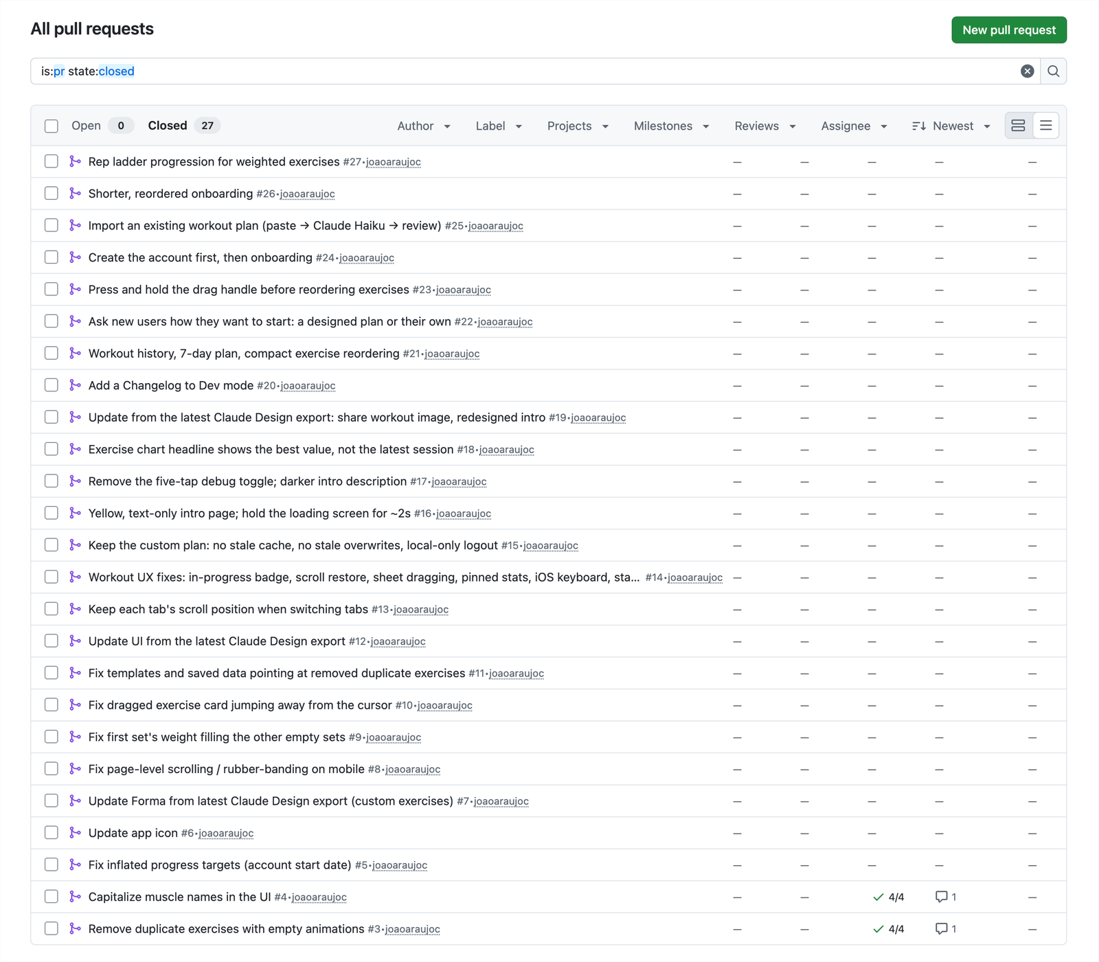
All in all, steps 3 to 7 added up to nearly 30 pull requests in the first few days of development.

Forma's closed pull requests on GitHub, from removing duplicate exercises to rep ladder progression
Forma's pull requests on GitHub

Try it

Tap around to explore Forma live webapp.

What I'd validate next

Forma has four users so far: me and three friends — enough to catch bugs, but not to prove that any of my decisions were right. Next, I'd open it to more people, and follow up with proper user research questions after their first week to test those assumptions against real behavior. I'd also add basic event logging to measure user retention.

Last, I'd look for what would make Forma stand out from other workout apps. Right now, I think it's just an average workout app — its strengths are things any good workout app should do well: clear progress, sensible progression, a flexible schedule, easy plan import. The interviews and the data above could potentially help me find what's missing.


Designed by me in sunny Brazil 🇧🇷  ·  Credits to Figma's auto layout, Claude Design and plenty of coffee refills